Beem It Visual Brand Identity
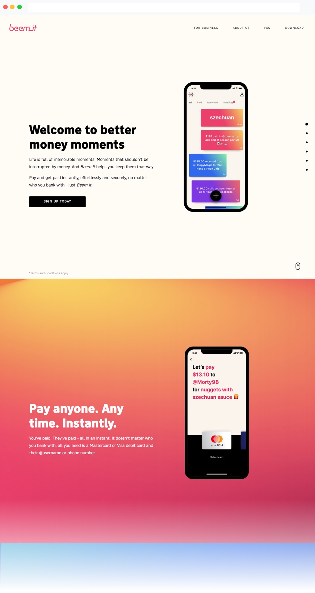
Welcome to better money moments.
The Project
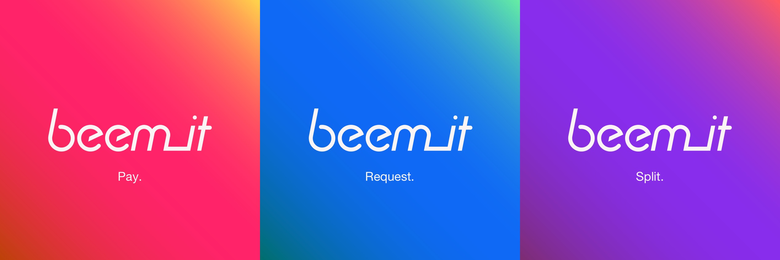
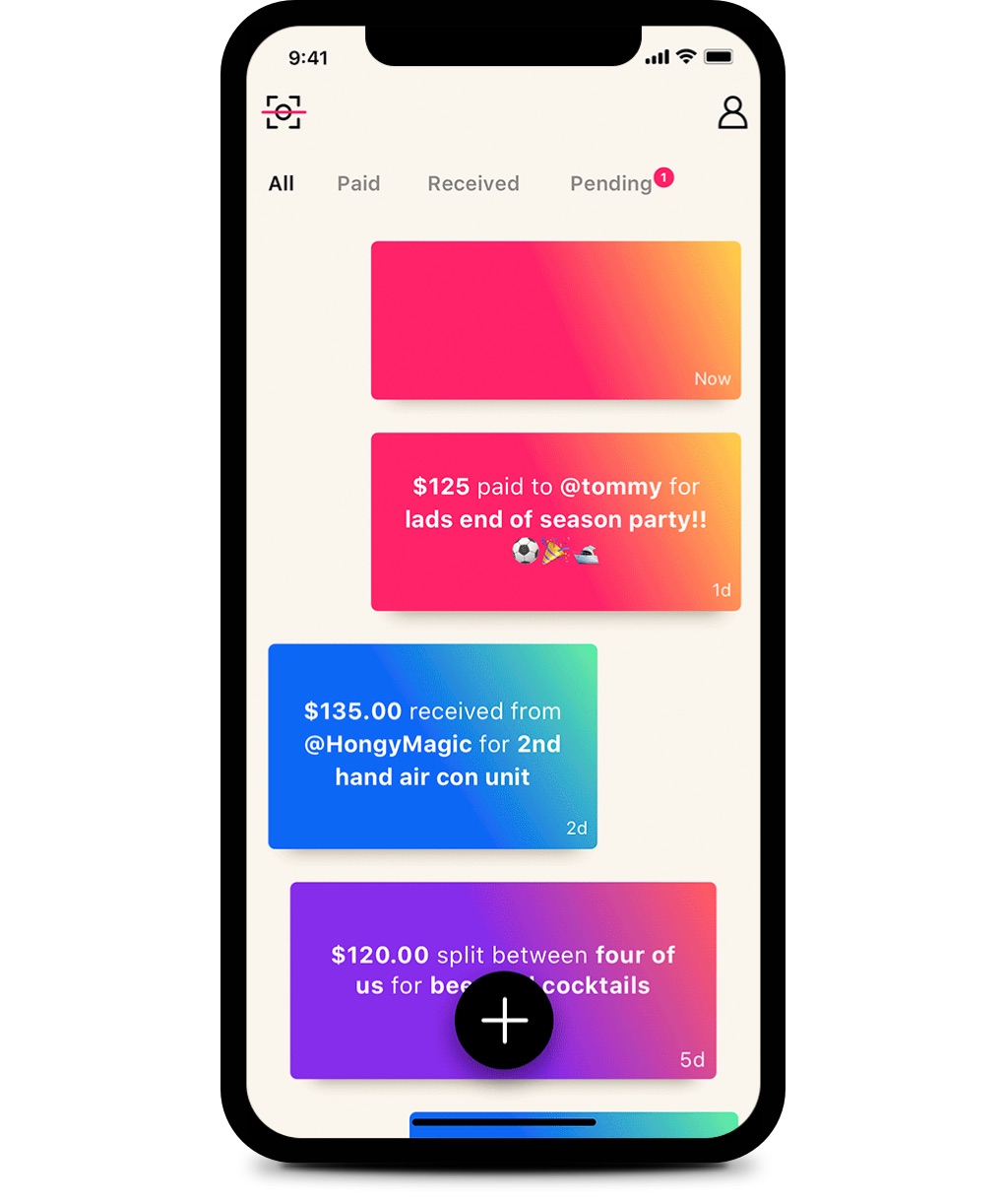
The Beem It app makes paying, splitting and requesting money social and fun. We needed to make sure people knew about it, because we needed to change their behaviour.
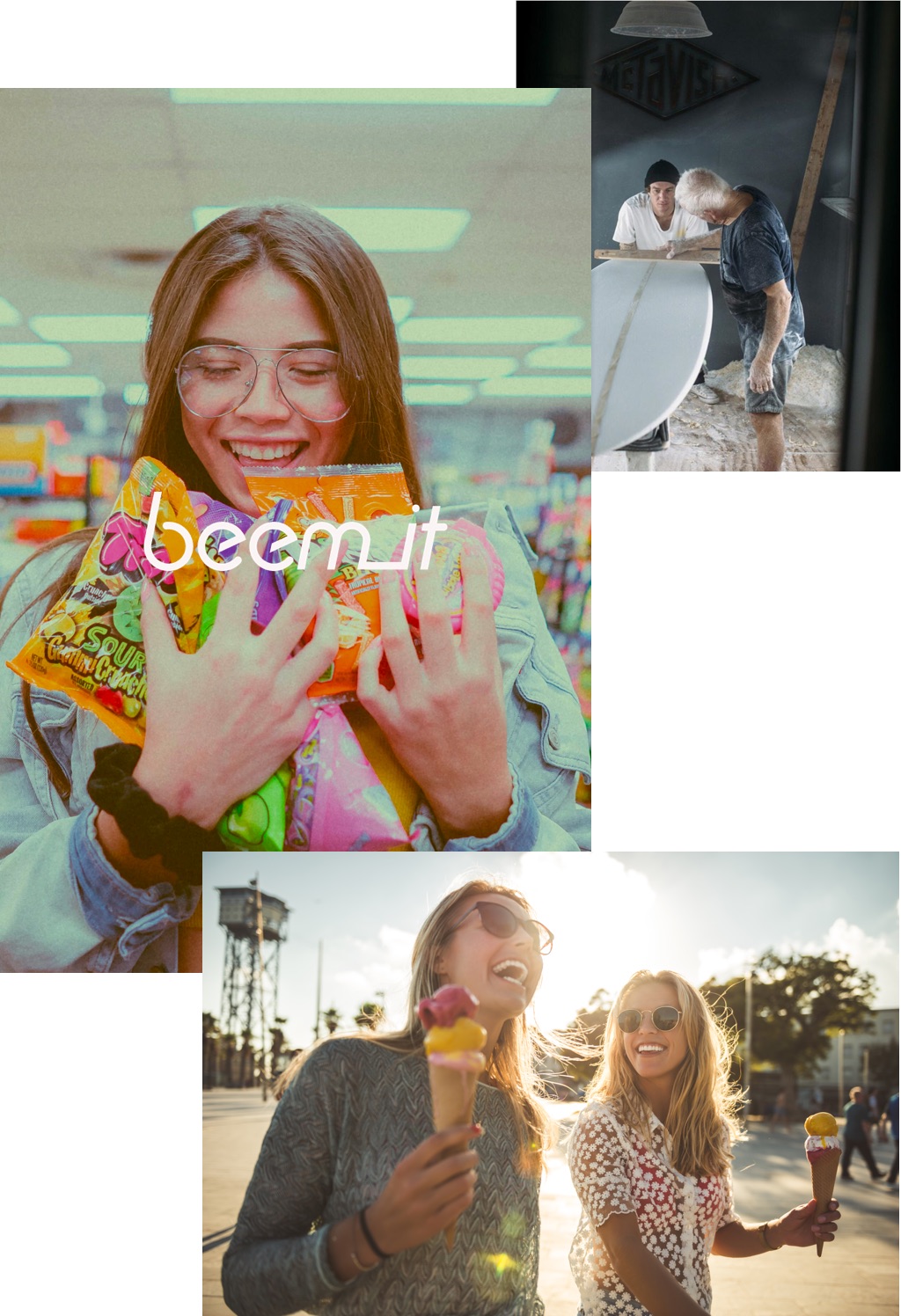
Life is about sharing moments, and these moments shouldn’t be interrupted by money. As Beem It takes money out of the moment, it lets people stay in it.
The Outcome
Create better money moments for everyone, by celebrating fun times shared without worrying about money.
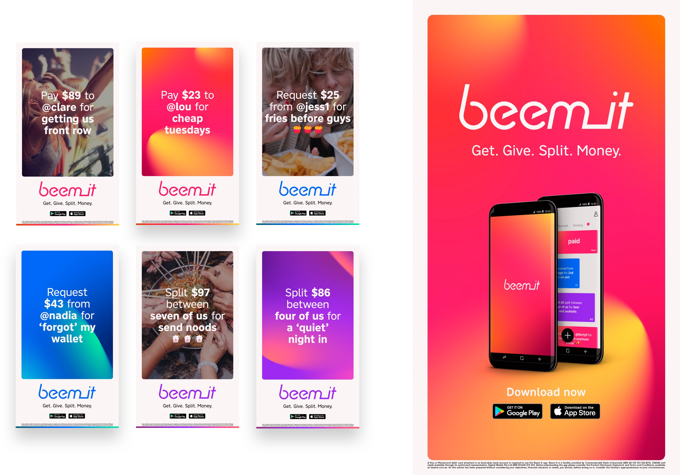
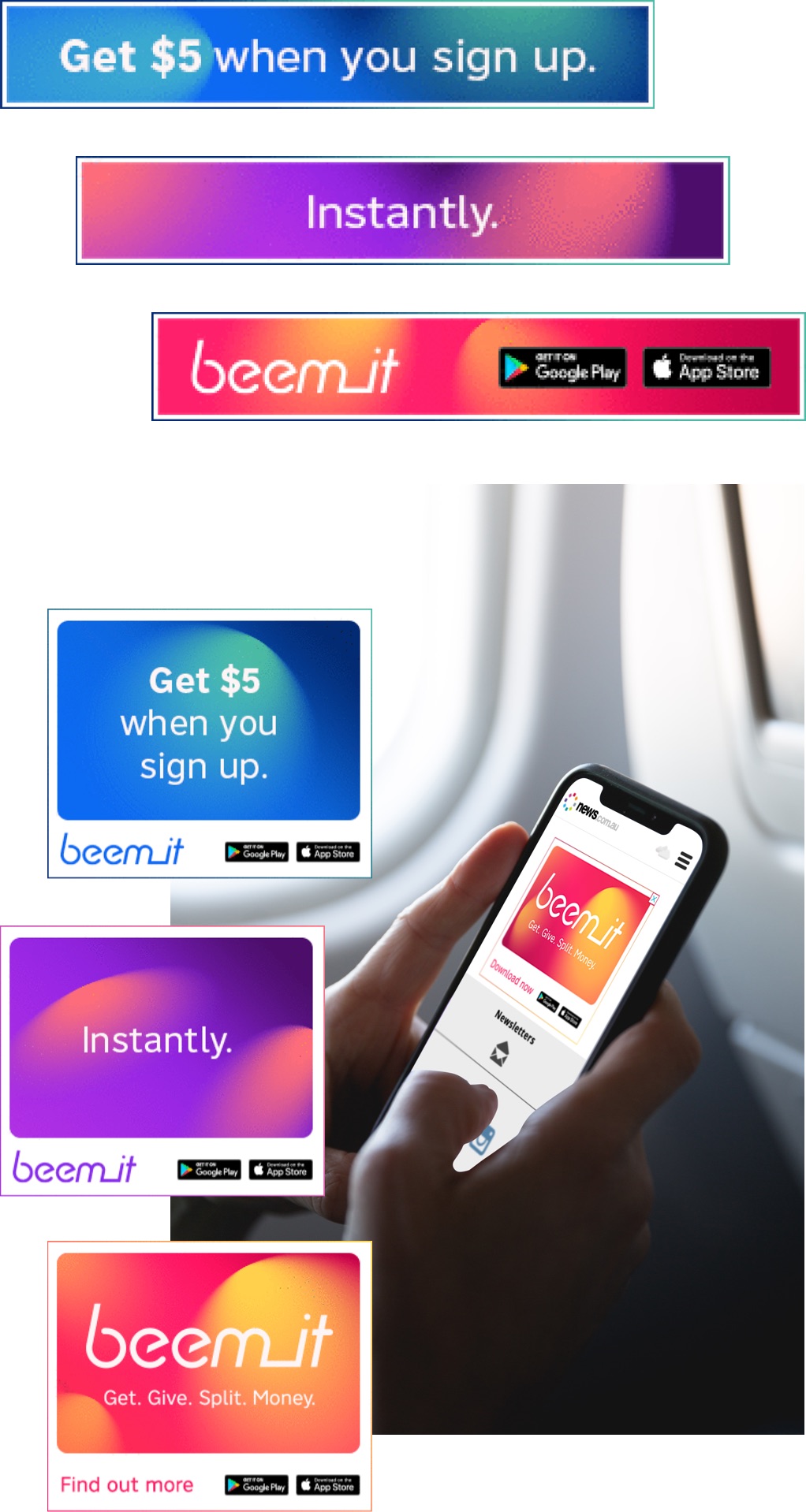
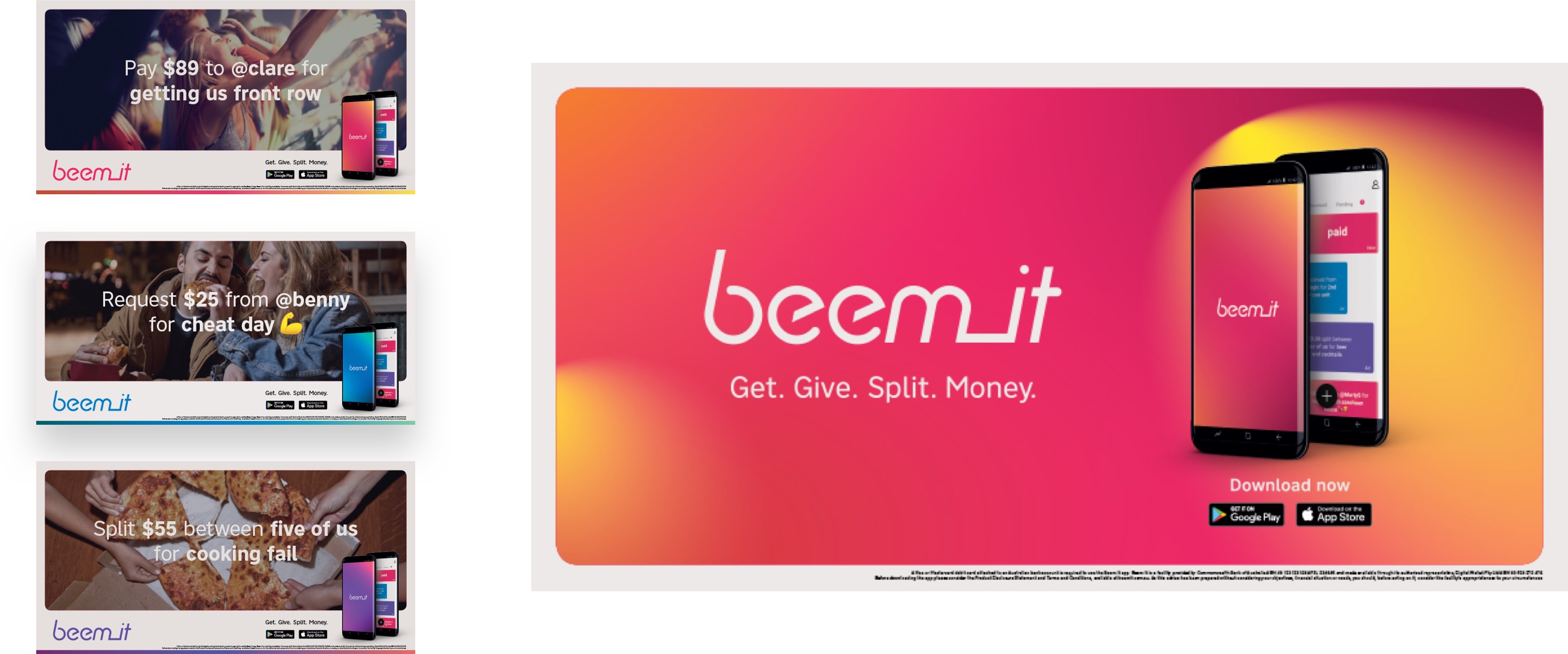
A highly-targeted campaign across OOH, radio and social made sure that the message was heard loud and clear by a notoriously hard to reach demographic. By celebrating moments that should be shared without worrying about money, we helped turn ‘Beem It’ into the common verb for money transfers.
Responsibilities
Visual Brand Framework
Facilitating and leading co-design workshops while creating an agency wide visual brand process to produce efficient and meaningful design intrinsically tied to the Beem It brand purpose.
Interface Design
Leading the design team in their collaboration with the design and production team from CBA in the implementation of the new brand into the app and their digital channels.
Credits
Agency: WiTH Collective
CCO: Steve Coll
Director of Data & CRM: Mark Razzell
Head of Digital Experience: Paul Kelly
Senior Designer: Jarrad Harvey
Creative: Courtney Fay & Kate Ross
June, 2018
