NRMA Website Redesign
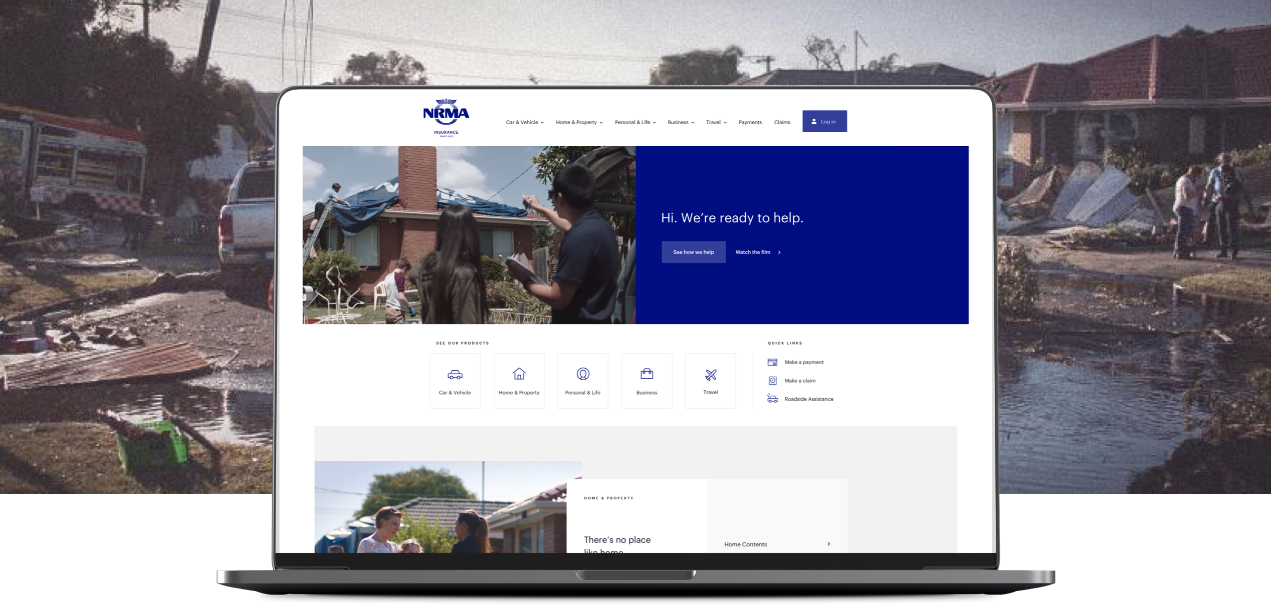
Building value into the online experience of one of Australia’s most iconic brands.
The Challenge
The NRMA brand is perceived positively but despite increased website traffic, there was no uplift in quality leads coming from the platform. While NRMA are well known for their great customer service, their online experience was dated, disjointed and structured in a way that users couldn’t easily navigate.
Insurance is often a begrudged and poorly understood purchase. The NRMA website needed to be redesigned to address more of the customer experience needs beyond the ‘explore’ and ‘decide’ phases of an insurance purchase journey. This presented an opportunity to improve the overall perceptions of NRMA and demonstrate the value of their full offering by enhancing the role of the website throughout the entire customer journey.
Research synthesis
Unsurprisingly, NRMA had a lot of existing audience and user research that required synthesis. While pre existing work had been done to map an optimal customer journey, the focus for our team was to provide better understanding of key audiences needs and the role the website could play in supporting them.
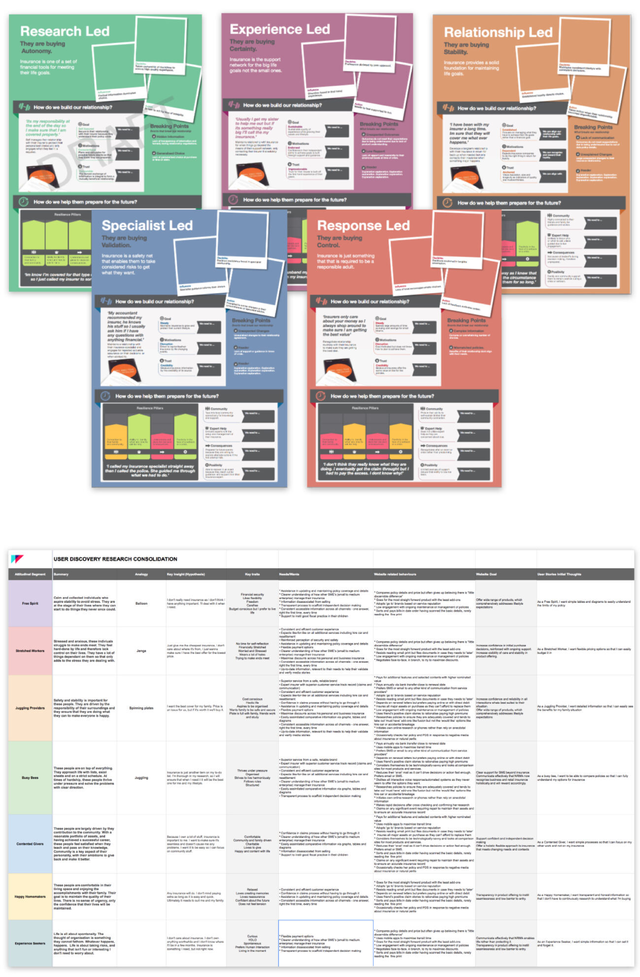
In overseeing the extraction of key information from multiple sources including attitudinal segments, audience profiles and personas, it was important to synthesise this information into digestible and useful forms. This would allow us to achieve agreement on the key audiences with internal stakeholders while acknowledging the volume of pre existing work.
To do this existing audience research were grouped into hierarchies and their relationships to one another were defined as segments, profiles and personas. These were synthesised into lean audience profiles, as this gave the most practical view of key audiences by focusing on their relationship and opportunity within the insurance category.
With a mix of existing research in flux, we also conducted our own surveys and research. This provided additional impartial validation of key audience considerations to inform useful and guiding insights.
Task models and user stories
A primary guiding principle coming out of audience research was that users wanted to see the care and help that NRMA provided in person, more present throughout the site. User research revealed, people are happy to pay more for better help, so the website embraced the most positive and best known aspect of NRMA, their great customer service. Improving this demonstration of value through site pathways was prioritised over enabling mindless clicks of the ‘get a quote’ button.
Task models and user stories were created from a mix of research data, stakeholder and audience interviews. These would go on inform the backbone of highly relevant feature sets for both the website and content strategy.
Segment and interactive data
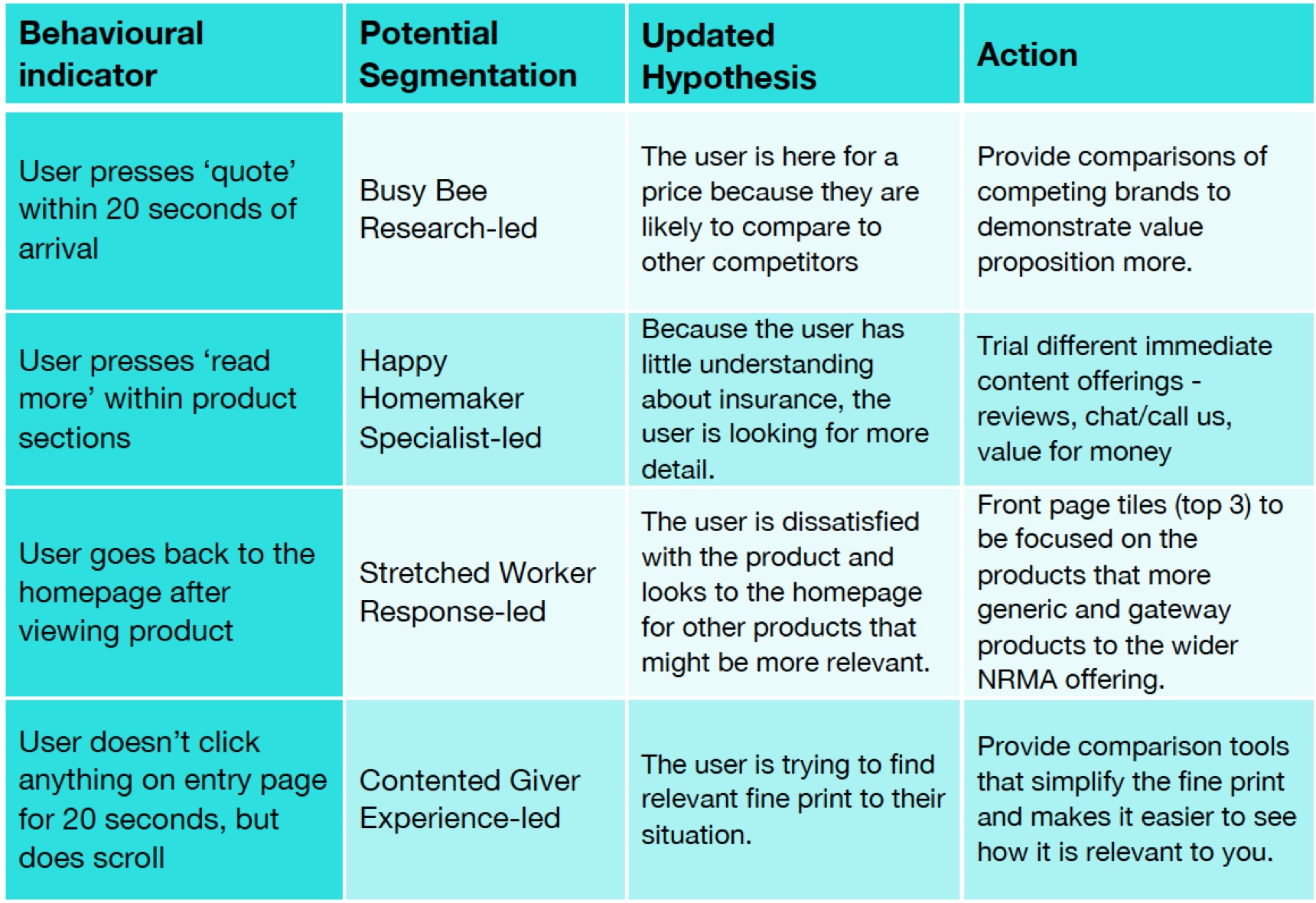
It was important to work closely with data teams to be aware of any insights from existing site usage as they began merging our synthesised segment profile data with interaction data to form a content strategy that could support future site personalisation.
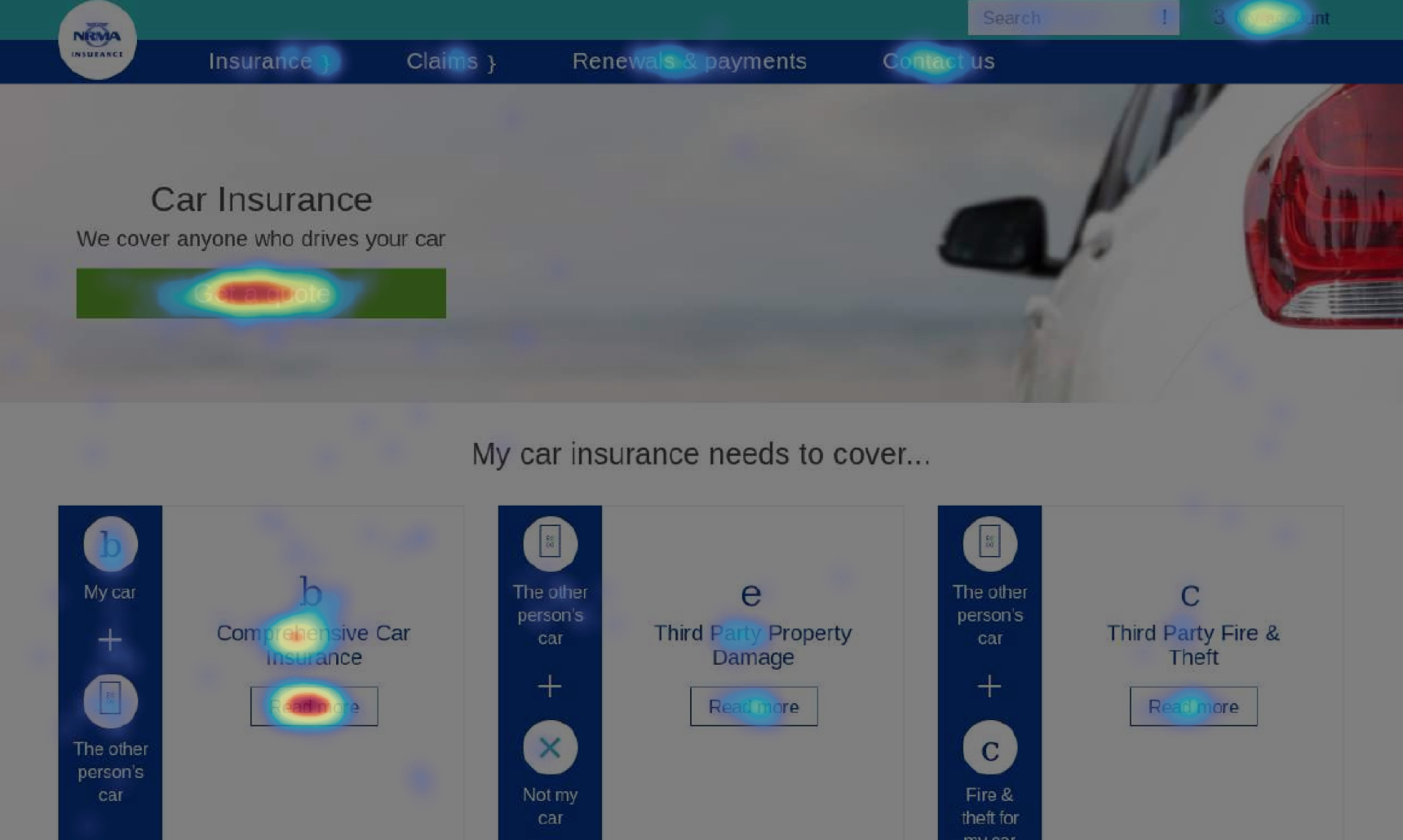
It was uncovered that only limited knowledge of how users interacted with the site was available. Existing analytics were only set up to track sales funnels, as opposed to tracking behavioural indicators. Because of the lack of a logged-in state, it was also difficult to derive a users identity and map them back to segment types. However, what we did find gave us visibility to the key pages and how they were interacted with on the website. This enabled us to determine the key user’s needs and relate them back to our segment cohorts for informed data led content and feature decision making.
IA card sorting
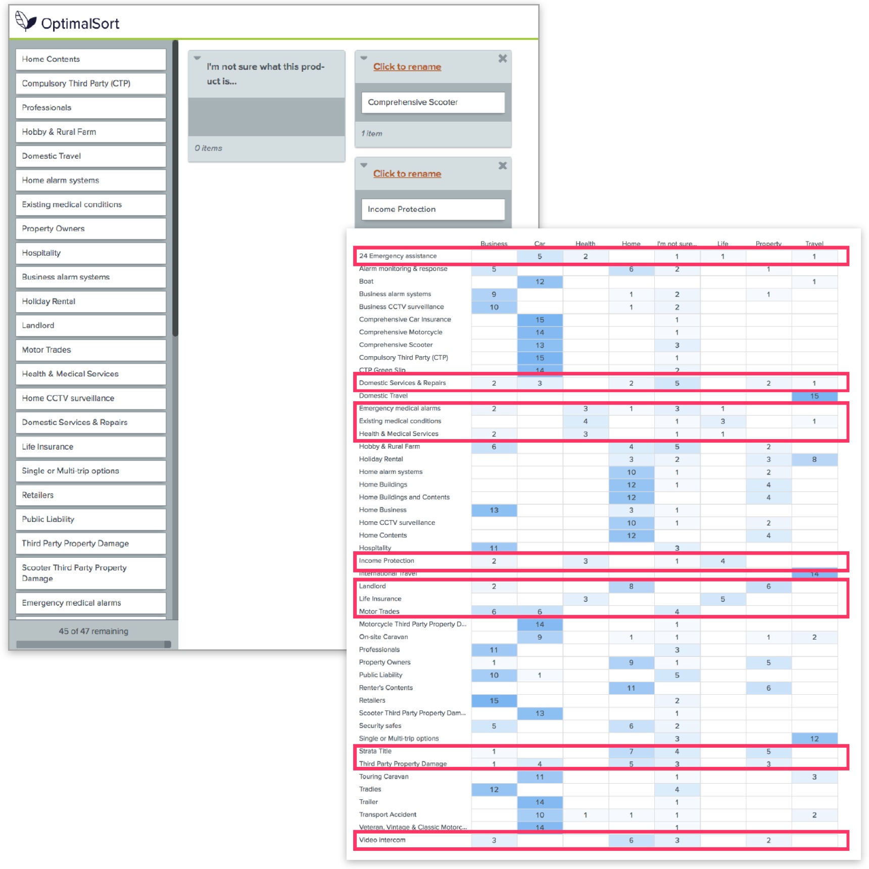
People generally have limited inclination to educate themselves on the topic of insurance. To gain clarity on an effective information architecture that would make sense to users, a mix of closed and open card sorting sessions were run to allow users to organise products into groups that made sense to them.
This revealed users understood most NRMA products but ambiguously named products such as ‘Domestic Services and Repairs’ were poorly understood. New product names and IA structures to house them were recommended based on this user research.
IA tree testing
WIth the use of Treejack, users were assigned actions to complete and their pathway to realise them were recorded.
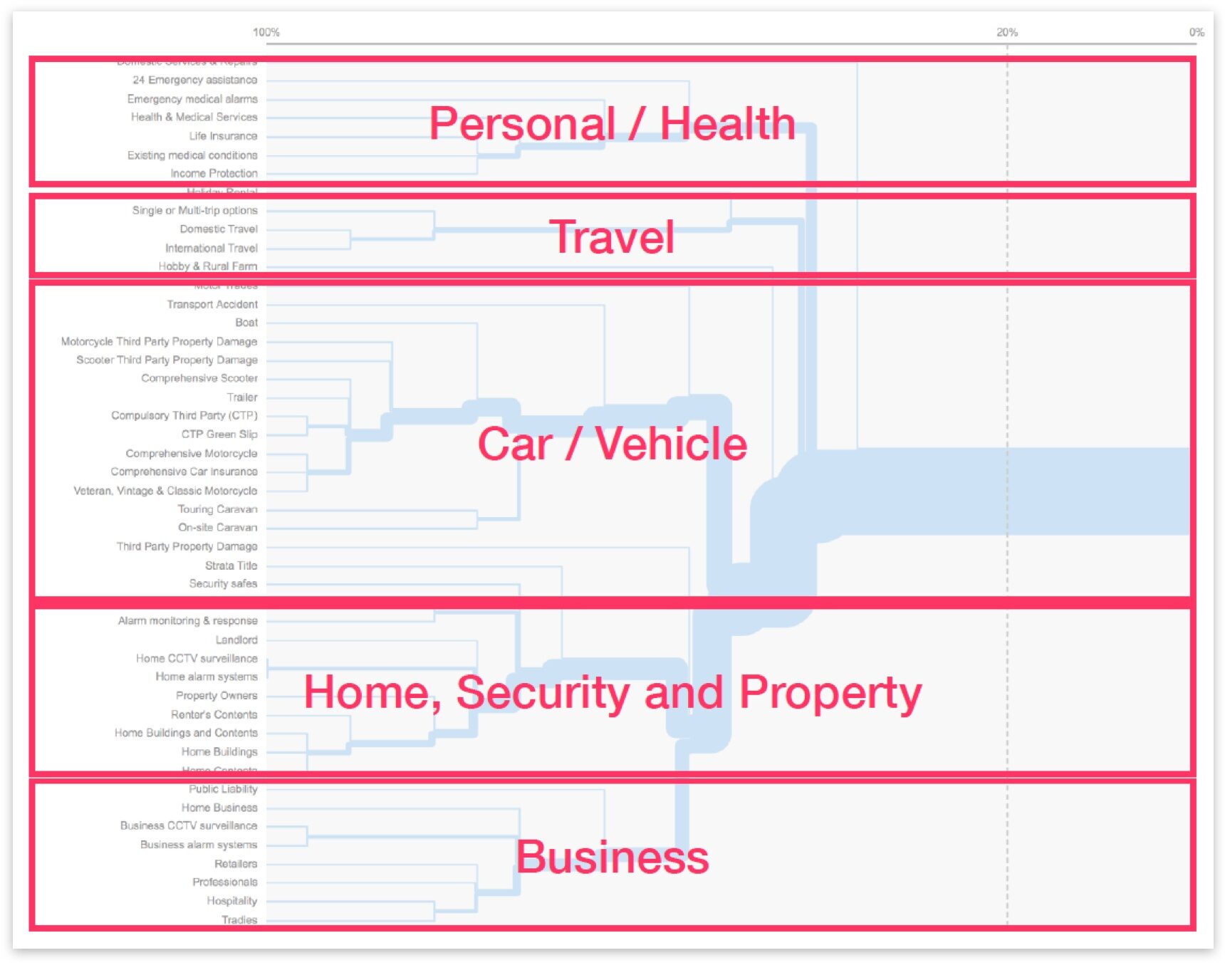
This provided strong insight in how the navigation should be organised and opportunities to improve pathways through the site were identified. From this we could determine that products fell into five clear categories:
- Personal / Health
- Travel
- Car / Vehicle
- Home, Security & Property
- Business
Collaborative wireframing
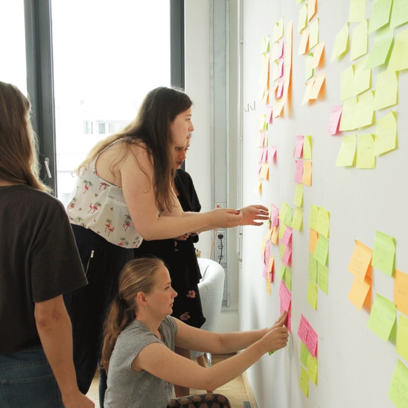
The wire framing stage provided the ideal process to marry identified user needs with business needs. User centric features, derived from user stories were captured as comprehensive feature sets. These were displayed as large, paper based, single items and then organised through immersive group stakeholder workshop sessions.
This allowed all key stakeholder voices to be heard, provided an opportunity for alignment with cross functional teams and gave a strong steer to the expected hierarchy for us to validate as part of user testing at a later date.
Key milestone check-ins
Working closely with the Lead Experience Designer, Senior Digital Designer and Senior Digital Producers on a project that would go on to span many months, it was important to be available for regular checkins and at key project milestones.
NRMA underwent a rebrand process midway through the project delivery, requiring me to liaise with the lead brand agency stakeholders and consider impacts to our design execution. A modular design system minimised the impact of the brand design changes while regular review of all interface designs, patterns and module sets, ensured consistency with the evolving rebrand exercise.
The creation of user stories and feature sets allowed for considered review processes with team to realise the most effective UI design choices aligned to what was identified during the discovery phases. Understanding design challenges helped identify which design elements should be user tested to confirm their effectiveness in delivering business objectives.
User testing
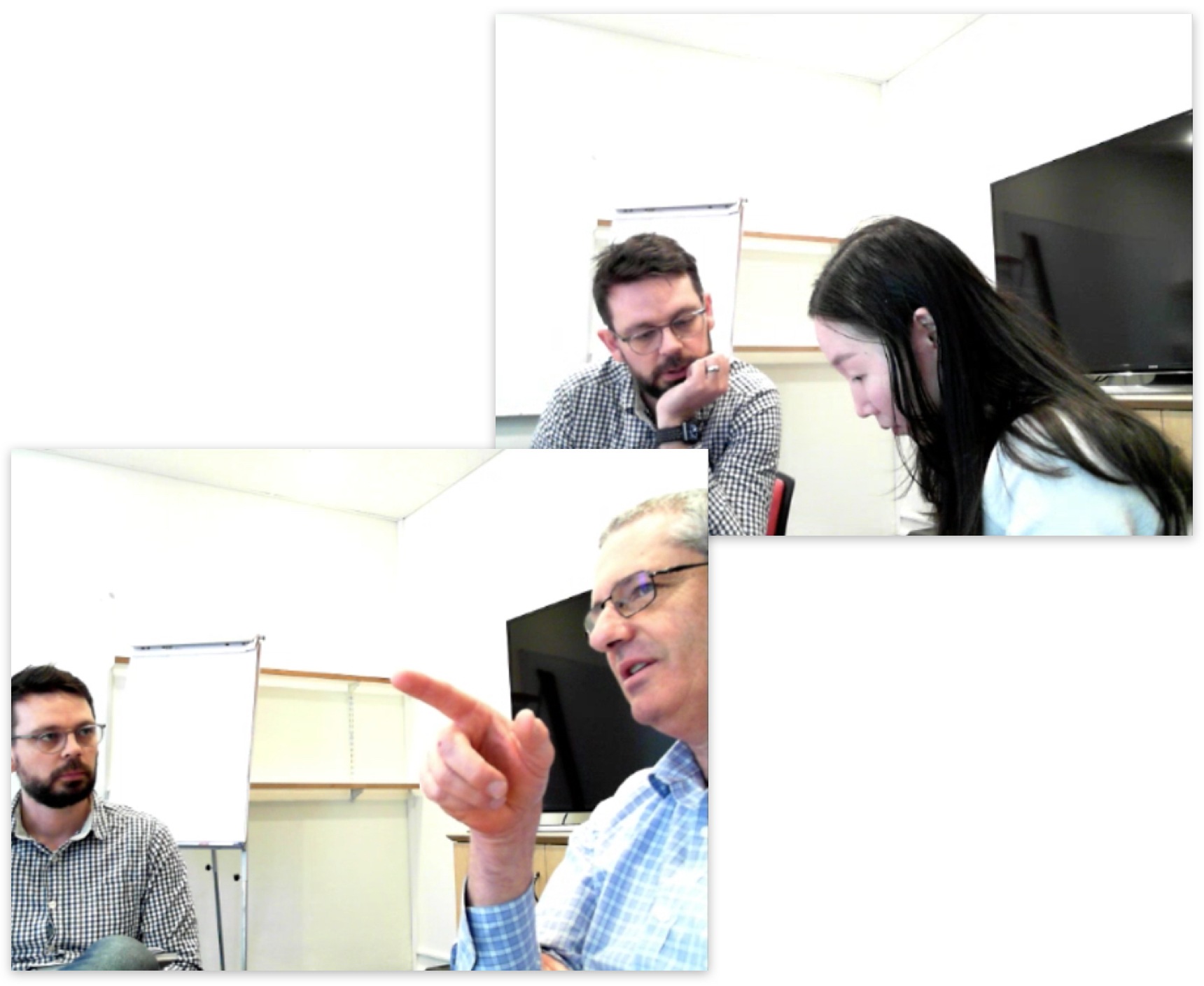
Multiple user testing sessions were conducted to validate high fidelity interface designs. I conducted a number of these user tests in partnership with other team mates to share the load and the learnings. Prototypes such as this navigation prototype were created. Test scripts were produced and agreed with client. The majority of testing I conducted and scripted were aimed at ensuring interface designs demonstrated value and enabled self service.
The prototypes overwhelmingly tested well and feedback was largely concerned with content rather than design changes. The qualitative results were captured and translated into recommendations that were compiled into user test reporting and shared with the NRAM team who were in the process of building the designs.
Design system
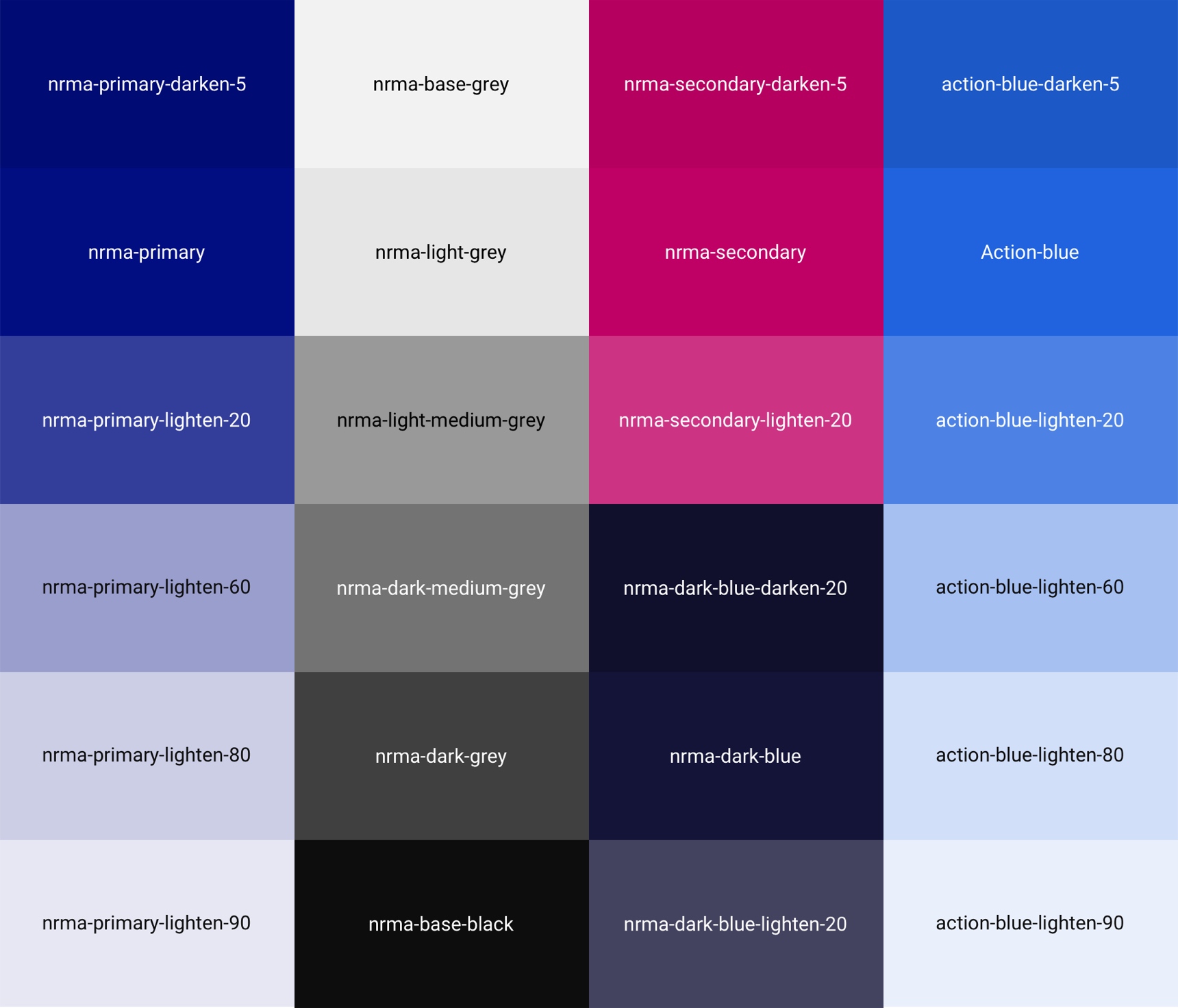
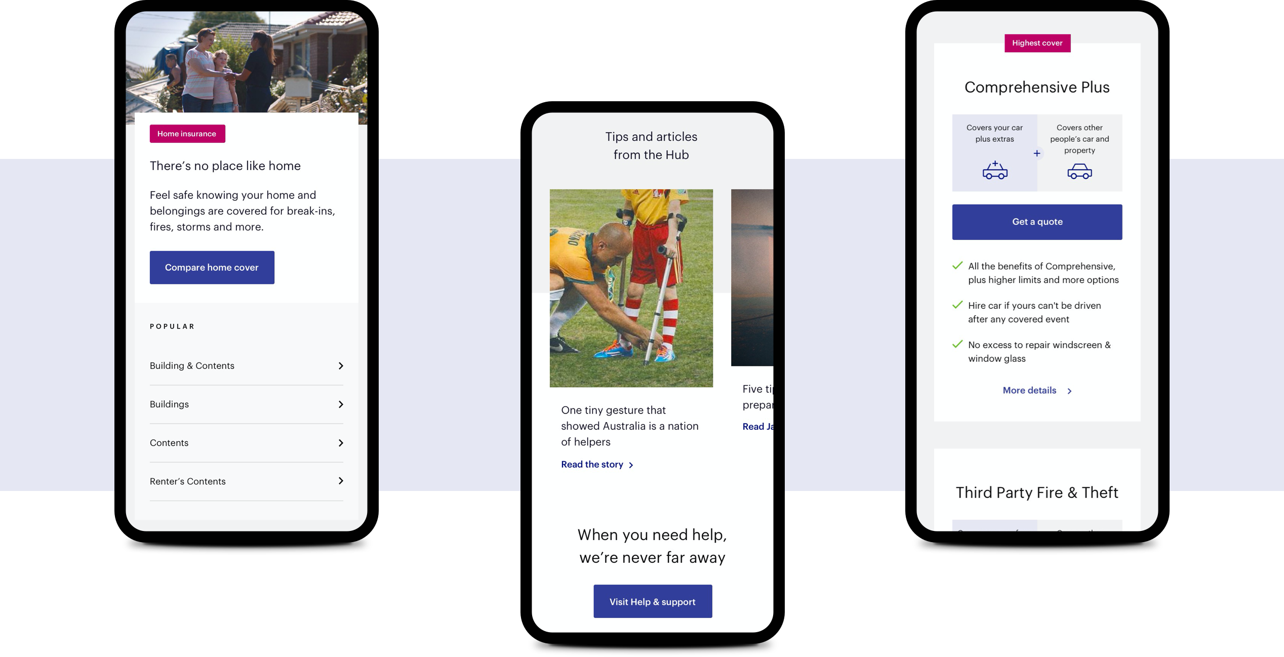
A responsive module and design system based on agreed wireframe components was built from scratch to cater for all the website content requirements. To ensure consistency aesthetically and functionally, all components shared common styles and behaviours.
The evolving NRMA rebrand process occurring at the same time impacted the ability to confirm some design system elements while the brand guidelines remained in flux. Additionally, IAG had been working on a design system named ‘Chroma’ that all IAG insurance brands should employ. Close working relationships with the external brand agency and the IAG experience design teams ensured the NRMA design system could cater all requirements.
Credits
Agency: WiTH Collective
Senior Digital Producers: Sophie Tschuchnigg & James Fricker
Head of Digital Experience: Paul Kelly
Lead Experience Designer: Paolo Sta Barbara
Senior Digital Designer: Stephen Brabazon
March, 2018
