Qantas & American Airlines
Showcasing Qantas’ partnership with American Airlines as a world-class experience.
The Project
Australians often travel to the US, both for work and pleasure. To give them even more destinations to choose from, Qantas forged a new partnership with American Airlines.
In order to go beyond a simple announcement, we needed to show that the American Airlines new international fleet was a class above its domestic offering. The new benchmark passengers could expect was conveyed with the line: ‘Two airlines, one world-class experience’, drawing parallels between Qantas and American Airlines by showcasing the two side-by-side.
The Outcome
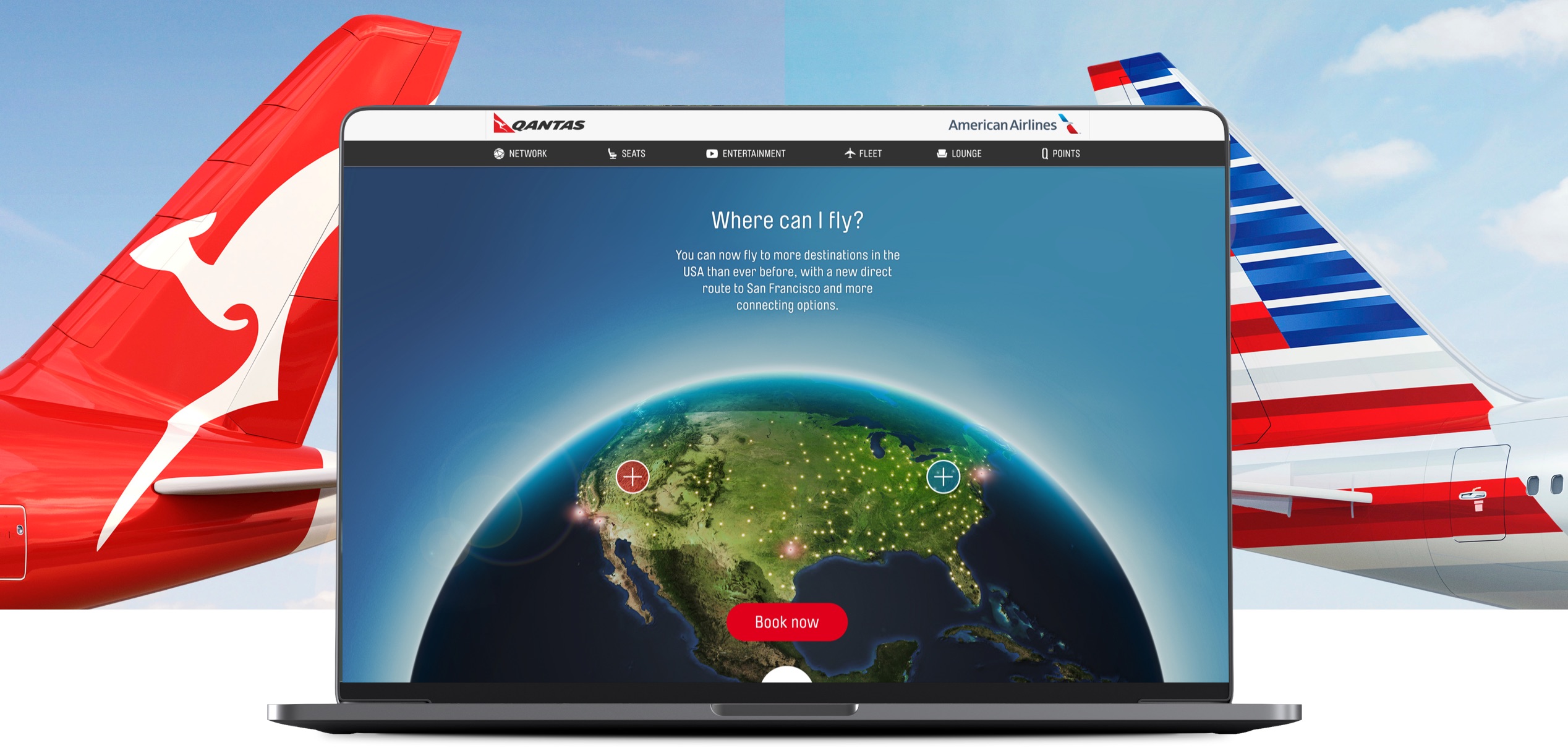
The ‘side-by-side’ visual device was used in content, outdoor, social, direct and dynamic digital communications to drive traffic to the landing page. The landing page with geo-location server routing delivered a customised location based experience for global users.
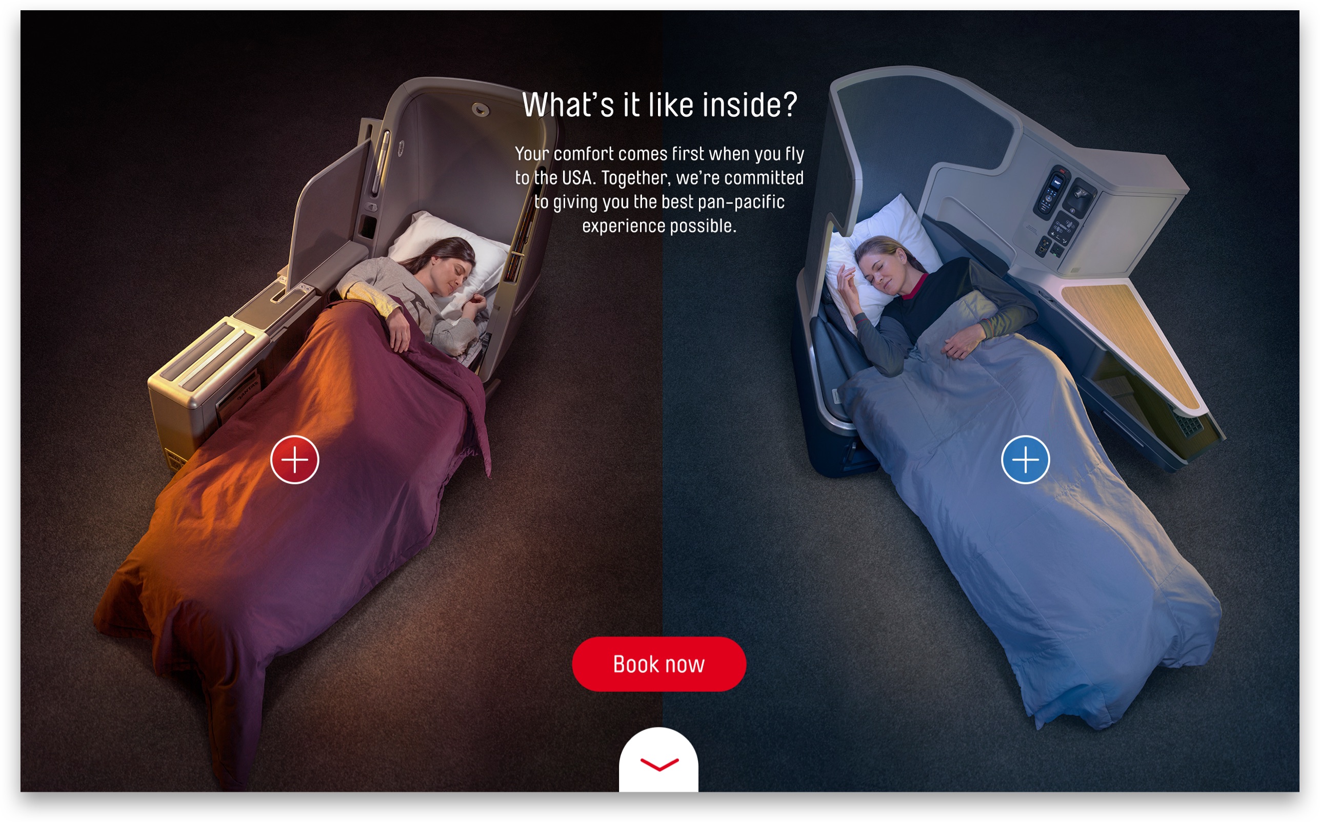
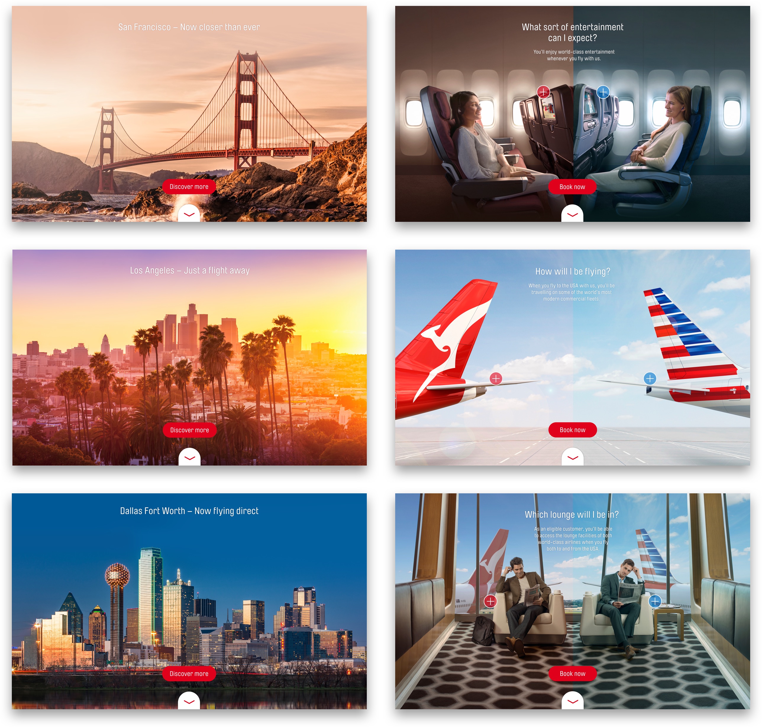
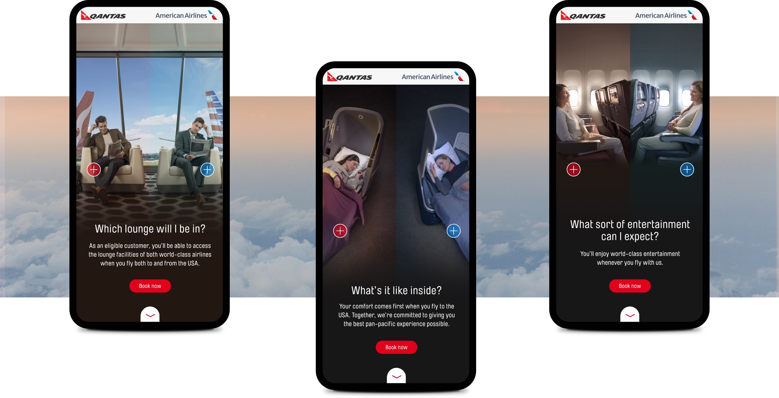
The landing page used an inventive split-screen parallax animation with full screen imagery to create an immersive online experience from the creative concept. Once customers ‘stepped aboard’, we showcased journeys to some of the new destinations, and included prompts to book.
Responsibilities
User Experience
Delivering a customer centric geo located approach that tailored content to international locations for the most relevant user experience.
Interface Design
Leading the interface design through the inclusion of an inventive split-screen parallax animation to heighten the creative and messaging side-by-side concept.
Credits
Agency: WiTH Collective
CCO: Steve Coll
Head of Design & UX: Paul Kelly
Art Director: Brett Walsh
Head of Development: Som Meaden
January, 2017
