Qantas Points Destination
Inspiring Frequent Flyers to earn more Qantas Points every day.
The Project
Qantas Frequent Flyer (QFF) wanted to cement their position as the number one loyalty program amongst their 10 million active members. QFF had identified a section of their members who had the potential to be more active in the airline’s loyalty program. They rarely flew and weren’t engaged with earning points across the breadth of the program.
With a myriad of ways to earn points, and some incredible rewards on offer, our task was to bring the hearts, minds and actions of Qantas Frequent Flyer members together with a truly rewarding experience.
To build and retain loyalty with this segment, QFF needed to communicate the earning potential members had within their everyday spending, building the value of Qantas Points and driving an emotional connection to the brand and rewards program.
The Outcome
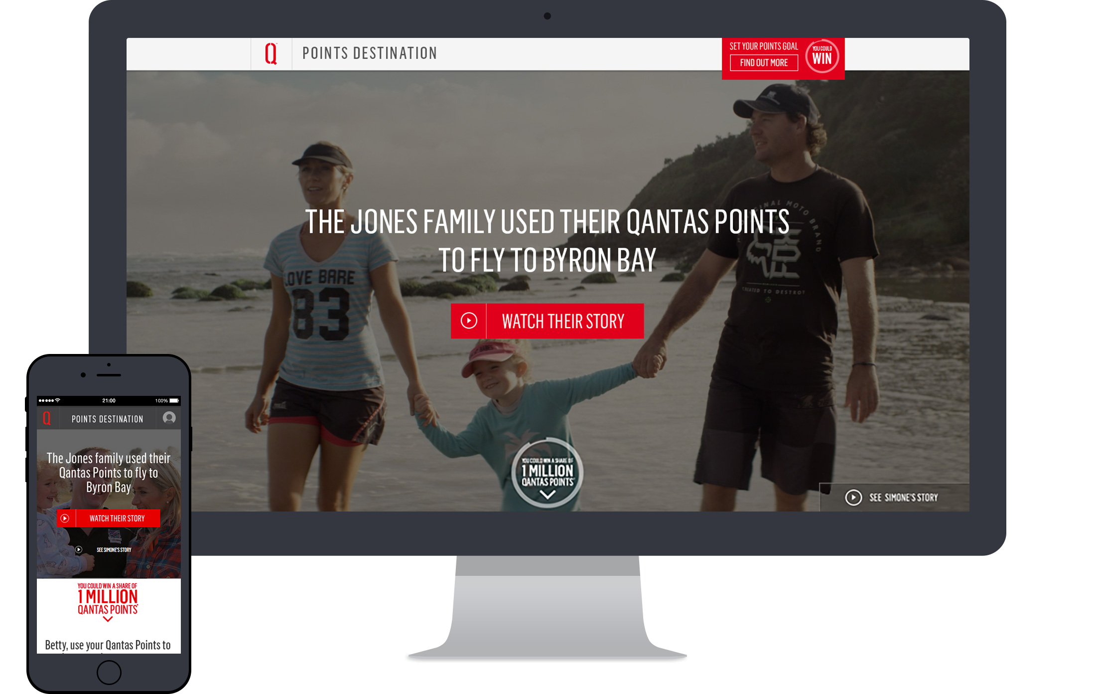
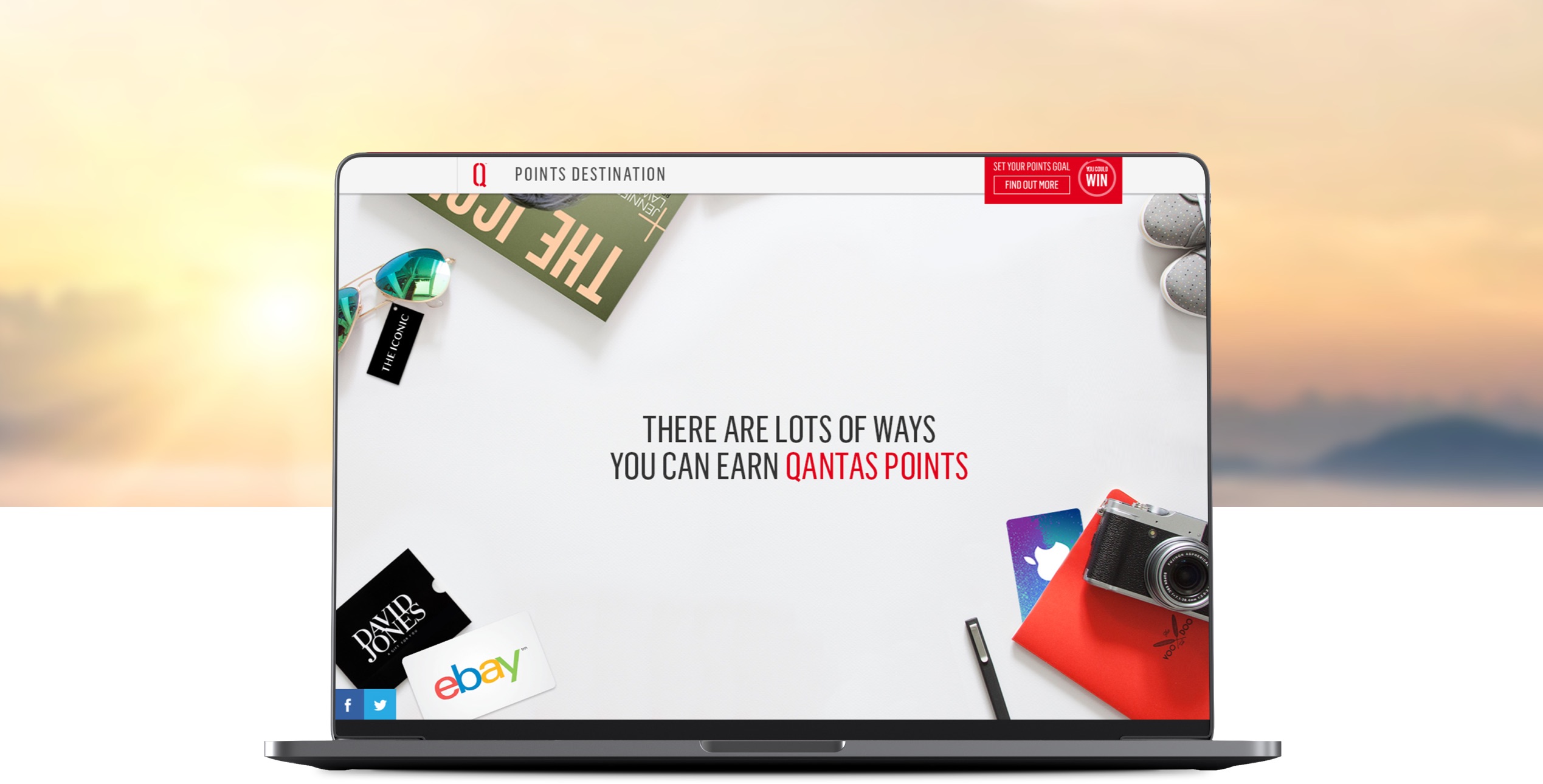
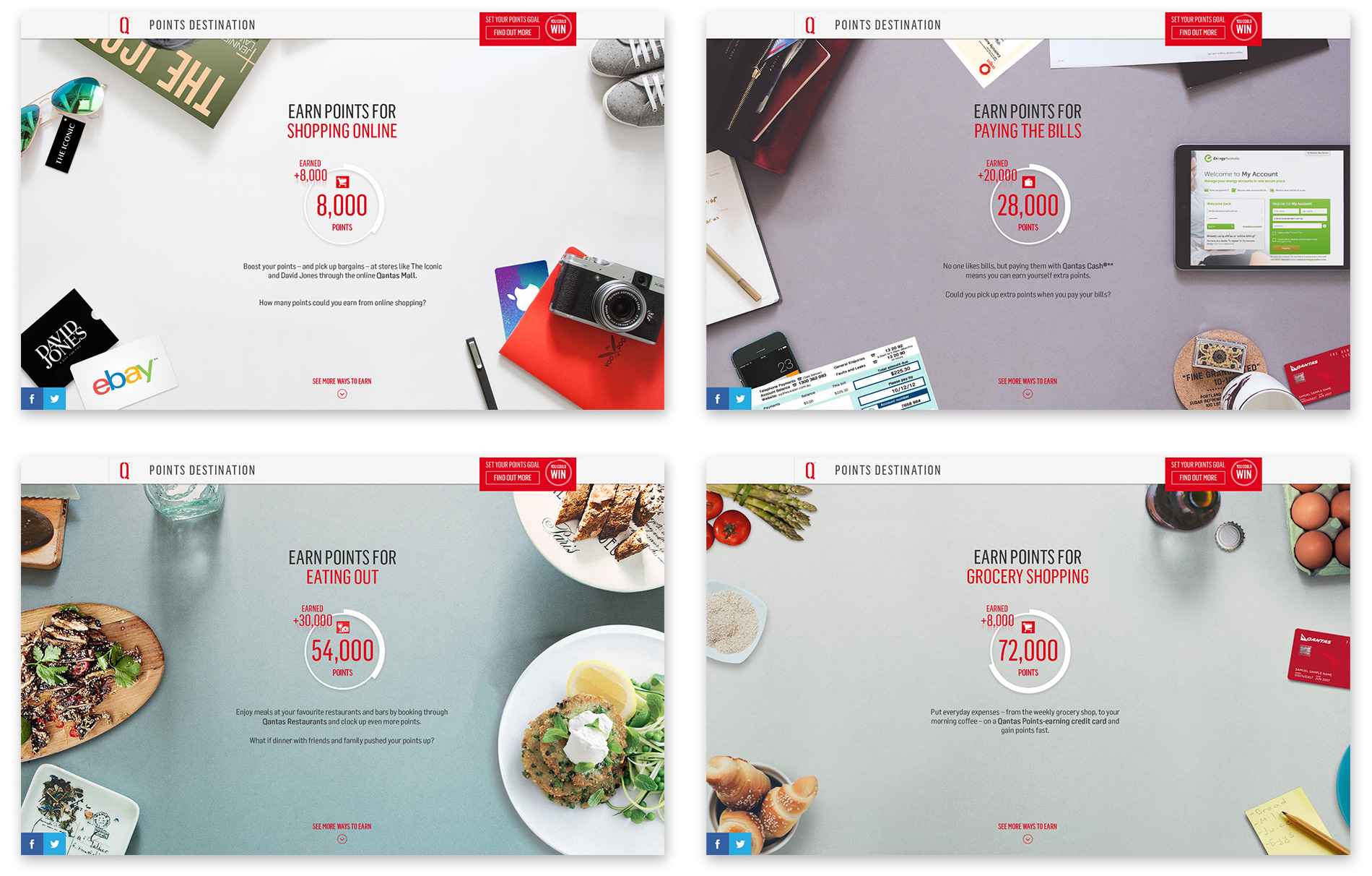
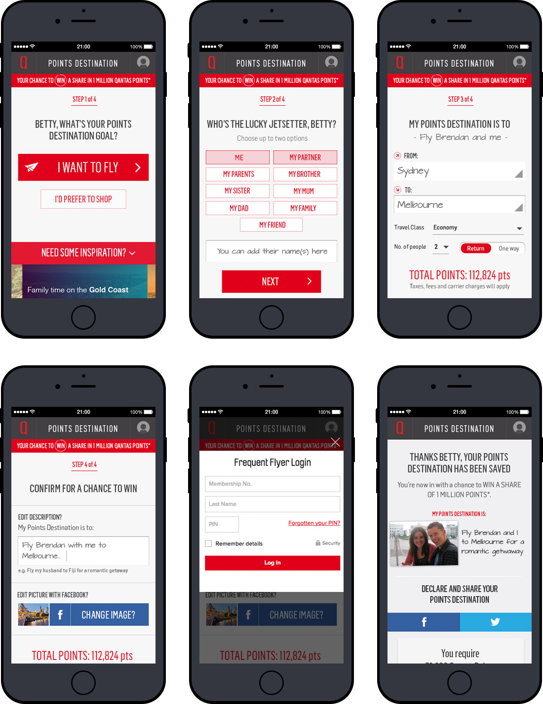
Driving an emotional connection with the program, we developed the idea of a Points Destination: a trip or holiday members aspired to go on and achieve by earning points. The Points Destination website welcomed users with inspiring real member stories told in immersive full screen video, while parallax interaction design visually demonstrated ways Qantas Points could be earned. Once a Points Destination was set, a custom-built API showed users the points they already had and automatically calculated how many more they needed to reach their goal – all in real time.
- Total Points Destinations set: 174,000
- Conversion Rate: 18.5%
- Page Views: Over 3,780,000
- Video Plays: Over 60,300
- Session duration: 2:10
Responsibilities
Wireframing & IA
I lead the creation of wireframes used to define page hierarchy and goal setting methods. These were also used to confirm user flows through low fidelity clickable prototypes.
Prototyping & User Testing
A high fidelity prototype was created and user tested to ensure users were able to create a goal for their points with as little friction as possible.
Awards
Bronze
July 2015
Winner
Best Website or Online Service
Winner
Consumer retention & loyalty marketing
2016
Credits
Agency: WiTH Collective
CCO: Steve Coll
Account Director: Adam Parsons
Senior Producer: Bonnie Ryan
Head of Design & UX: Paul Kelly
Senior Designer: Brett Walsh
Head of Development: Som Meaden
Senior Developer: Drew Kennelly
March, 2015
