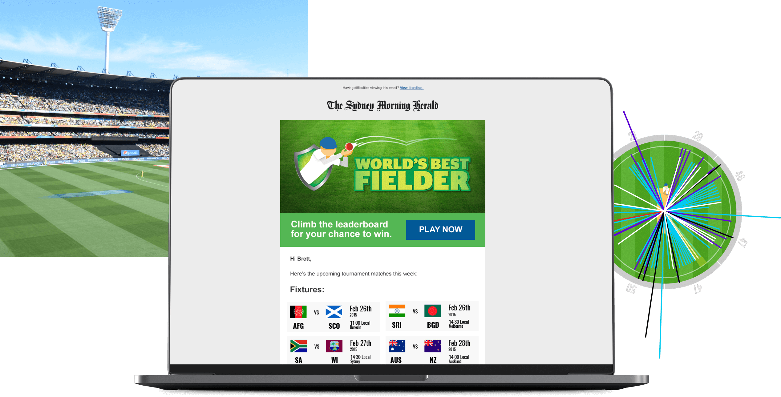
World’s Best Fielder
The game that allowed cricket fans to play every match of the World Cup.
The Challenge
The Cricket World Cup, one of the biggest sporting events of 2015, was jointly hosted by Australia and New Zealand in February-March. Fairfax knew Australians would be hungry for content, and wanted to be the go-to destination for fans seeking the latest news on everything World Cup related.
With a tight two month delivery timeline, our team had to move fast to identify a solution and produce it at rapid speed.
Experience led ideation
Knowing the importance of creating an experience that drove high engagement, our attention focused on gamification.
- Driving experience creation.
With a few cricket fans in the team, it was clear an experience that tapped into cricket stats and knowledge would perform well. It was important for me to influence the opportunity at briefing to realise an experience as an outcome, rather than just and awareness campaign. - Impact vs effort matrix facilitation.
Utilising design thinking prioritisation framework achieved team agreement on the most engaging idea. - Lead role in creative review sessions.
Experience with creative tech approaches, I was able to translate concepts into reality and develop ideas in partnership with creative and tech teams. - Presentation of initial idea to client.
Successful presentation and buy-in from the client was made possible by having explored tech avenues that gave the ability to present the ideas with confidence.
The idea
Put cricket fans where no one else could: On the field.
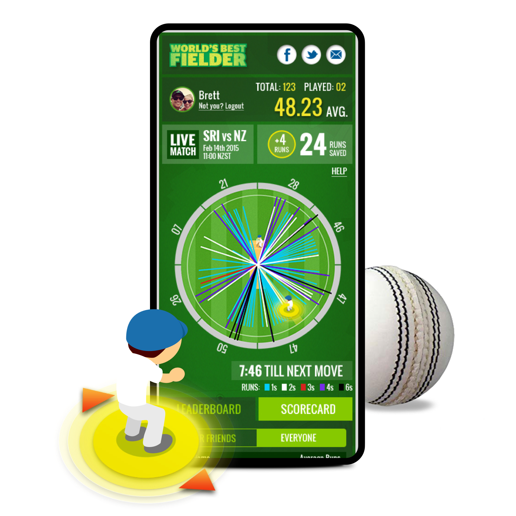
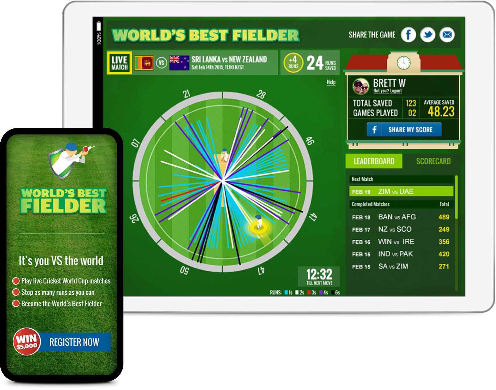
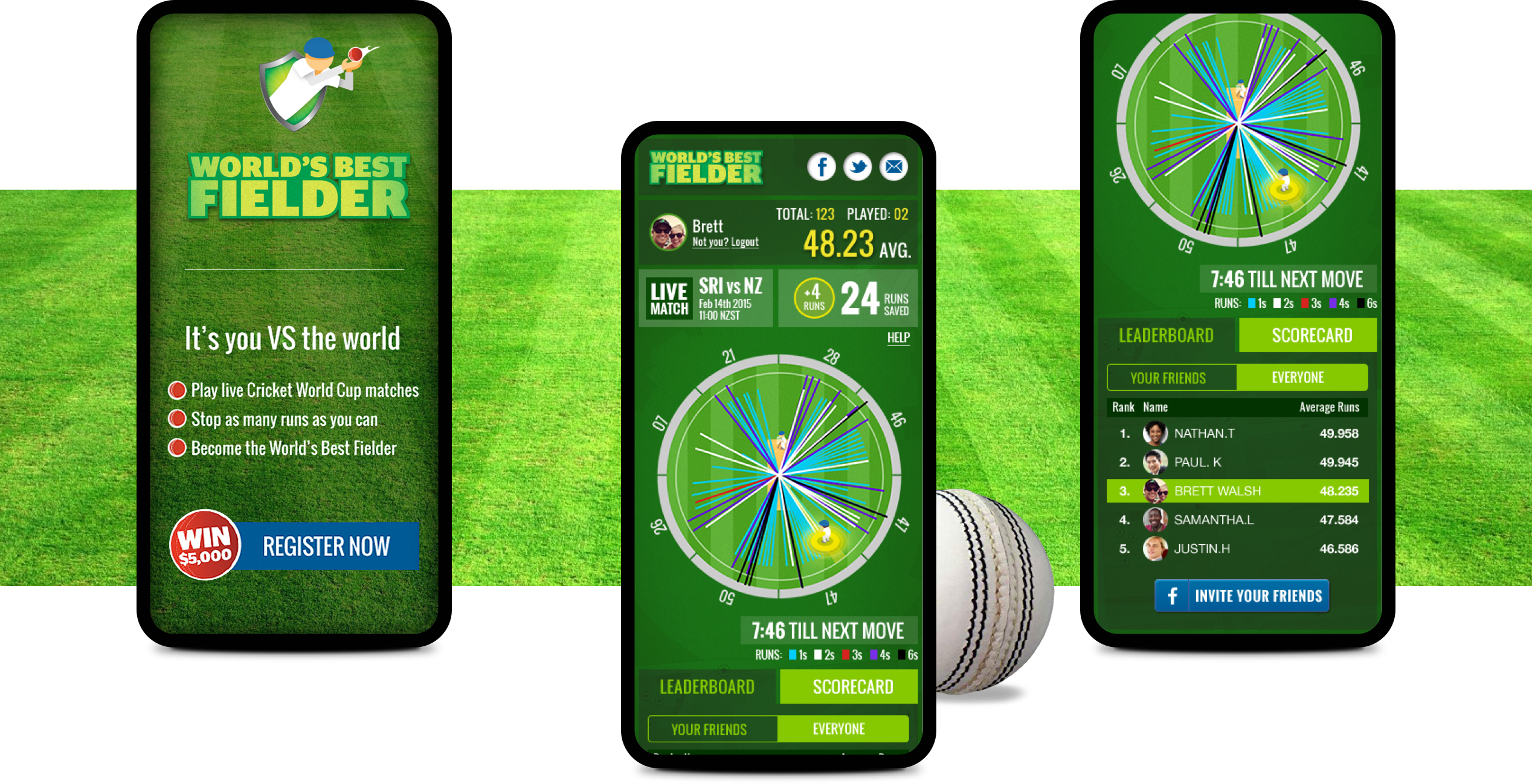
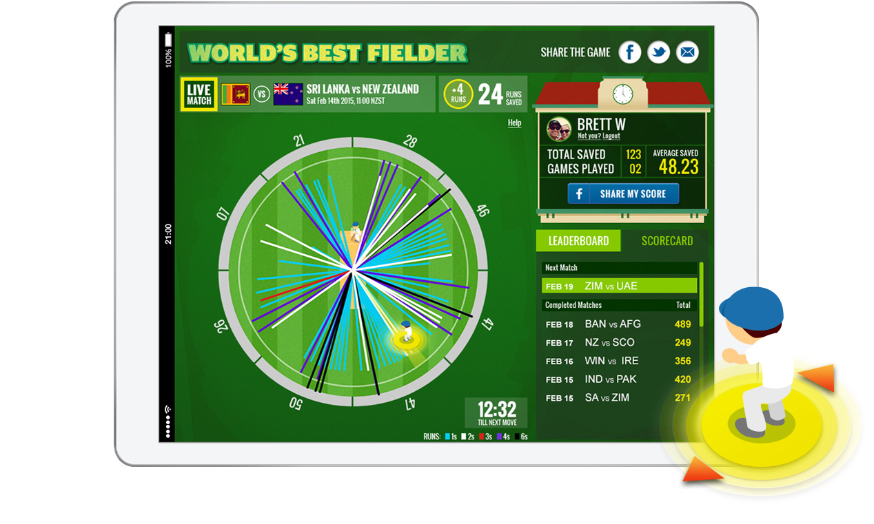
Using a real-time data feed from the Fairfax Match Centre, we created a game that let players control a virtual fielder to save the most runs possible during live matches. They could move their fielder based on their knowledge of the teams, and where the batting team were scoring their runs. The experience of watching the Cricket World Cup was enhanced through the API driven playing field, allowing users to play in real-time and to compete with their mates.
Lean UX design
With the idea confirmed, I lead a lean UX design approach that was all about validating as much as possible as quickly as possible.
- User flow definition.
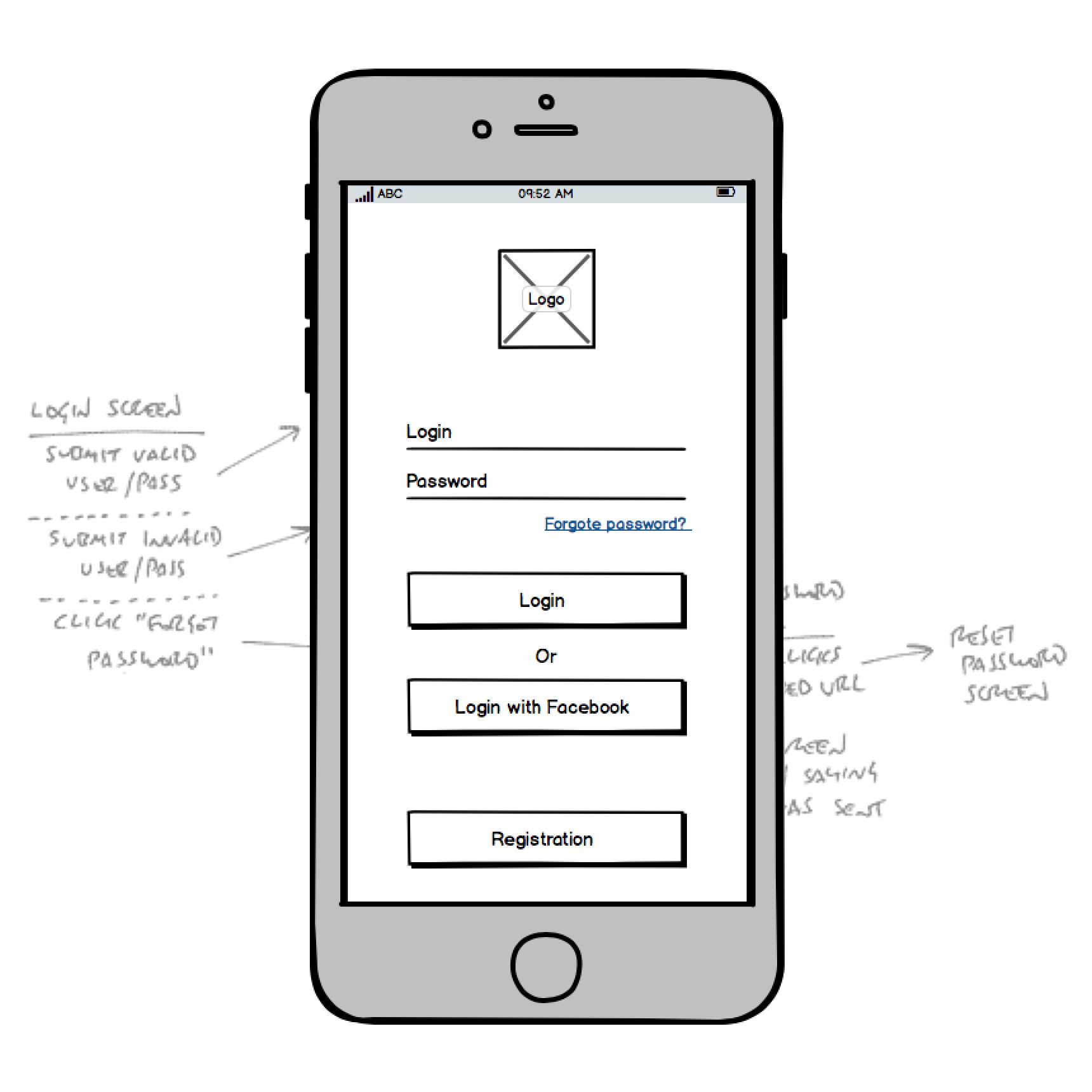
Working closely with Head of Development, very lean user and data flows were constructed to agree requirements and allow dev to begin, while spotting opportunities to drive repeat visits. Pen and paper were our friends. - Wireframe creation.
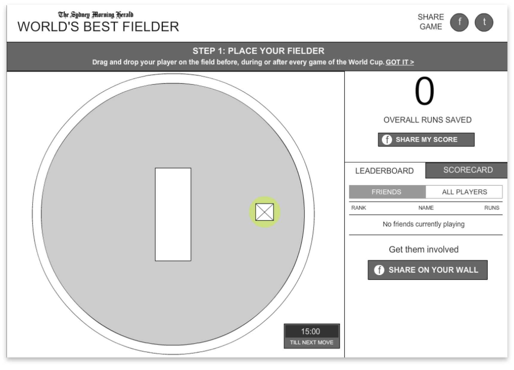
Mobile first medium fidelity wireframes were created based on user flows. - Prototype testing.
The wireframes were used to perform guerrilla testing with staff in the agency, family and friends. This allowed us to uncover any snags in the experience before progressing too far in build or design.
Testing outcomes
Lean user testing was conducted with iterative low fidelity clickable prototypes to find optimisations and resolve barriers to entry.
- Walk through needed.
A short ‘how-to-play’ walk through was identified as required to maximise game impact and game understanding quickly. - Social sign on.
Social sign on was quickly recognised as needed to reduce friction in registration and maximise social integration. An obvious oversight moving at speed. - Registration a barrier.
Registration at the front of the experience was identified as a potential barrier. Weighing up the barrier potential versus data gathering opportunity, the client was interested in prioritising this at start. - Timer to move the fielder.
In build it was discovered that the API data feed required a short delay to display live results. To overcame this a design feature was created out of it to put a timer on the ability to moving the fielder, coincidentally making the game more sticky and drive repeat visits.
UI design
Overseeing and approving all interface decisions for consistency and effectiveness of experience:
- Transparent and regular review cycles.
All interfaces were printed for easy comparison and put on a shared wall for team wide visibility, with twice daily design reviews. Approvals included review of traffic driving media design through to web app builds to ensure consistency of entire user experience. - Constant collaboration with tech and creative teams.
Strong working relationships with Head of Development and creative team leads were essential for informed experience decisions. Through this process, the interface was enhanced with cricket stadium themed elements and advanced fielder interactive states for increased interaction playfulness. - Tracking game performance.
Being Google Analytics certified enabled me to regularly monitor and track media and gameplay performance. Media adjustments to placements and messaging were made while confidence around the app performance was known by observing data flows.
The Outcome
World’s Best Fielder added another dimension to the Fairfax’s Cricket World Cup content with nearly 30,000 unique visitors engaging with the game. The intuitive design made it easy for players to get started – and get hooked. Players could pick up where they left off playing on any device while the game timer kept them coming back again and again. Here’s some of the results:
- 856,140 runs stopped
- 21,672 games played
- Played in 107 countries
- 4 mins+ average play time
Awards
Highly Commended
UX, Interface & Navigation Design
2015
Highly Commended
Art Direction
2015
Finalist
Mobile App
2016
Credits
Agency: WiTH Collective
Creative Director: Hamish Grieve
Account Director: Ria Collins
Senior Project Manager: Pedro Santos
Head of Design & UX: Paul Kelly
Art Director & Illustrator: Brett Walsh
Senior Copywriter: David Lucas
Head of Development: Som Meaden
Senior Developer: Drew Kennelly
February, 2015
